
Dr. Drang, in a post replete with examples of icons of popular apps from the original Macintosh, in their one-bit glory:
You can see that Apple liked the idea of app icons being a
tilted rectangle with some image inside the rectangle to
indicate what the app did. The hand was Apple’s way of telling
you that this icon was for doing things, and the rectangle was
tilted to match the orientation of the hand. (If you were
left-handed, this was just another injustice inflicted on you by
a cruel right-handed world.)Document icons were typically upright rectangles with dog-eared
corners and similar designs inside the rectangle — no hands
because documents don’t do anything. But we’re not here to talk
about document icons.
I never loved the hand on these icons. It felt too uniform. It functioned like a “this is an application” badge, but such a badge never felt necessary to me. But it was so ubiquitous I sort of stopped seeing it, and now, in hindsight, it holds some nostalgic warmth. Right from the start, though, TeachText didn’t have a hand — just a pencil. This is from System 1.0:
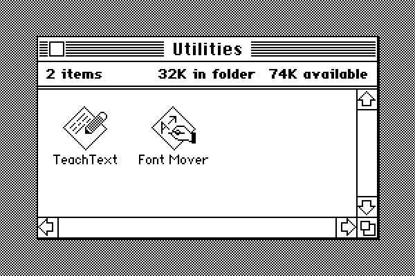
That TeachText icon was prescient about the future of good icon design. A year later the renamed and expanded (it now moved desk accessories in addition to fonts) Font/DA Mover lost the hand and became a fun truck (also prescient of great icons to come):
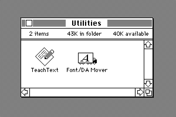
(So many little things were still in flux in those primordial days. Note the bold text in the Finder window status bar header in System 1. That kind of looks cool, though. But the single-story “a” in the Geneva font — that’s just wrong, and gives me the ick.)
Drang continues:
Other publishers abandoned either the hands or the tilted
rectangle or both. As people got more used to working with Macs,
these clues for what’s an app and what isn’t became unnecessary,
and icon design became less constrained. Even Apple gave up on
them for utilities like Disk First Aid and Font/DA Mover.
I think it’s less that Apple gave up on them and more that it came into focus that the “hand holding a pen over a diamond-shaped document” convention was intended for document-based apps. It signified “This is a creative tool that you use to create documents”. Apps that weren’t about creating document files — like Disk First Aid and Font/DA Mover — got different icons. Font/DA Mover’s truck icon in System 2 signified that you use this tool to move things. Disk First Aid’s ambulance was an obvious metaphor for repairing something unwell. Moving and repairing are very different purposes from creating. Font Mover’s icon in System 1 wrongly suggested, if only subtly, that it was a tool for creating font-related document files of some sort.
But the main thing about the “hand holding pen over diamond” convention was that it was only ever a convention. If Apple’s squircle fetish were merely a convention, then third-party developers would be free to ignore it. Some conventions are merely fads — they come into and out of vogue quickly. Some are long-term trends that persist. But the ones that prove to be more than passing fads win out on merit in the marketplace of ideas. Mandating the squircles with squircle jail doesn’t make them a winning idea. It’s like claiming to win elections when credible rivals aren’t permitted on the ballots.
(Also, I am in complete agreement with Drang re: my favorite app icon of that era. So perfect, so fun, but so ineffable as to why it’s so perfect.)
