
Yesterday I wrote:
For the last 40 years Apple has only gone through three identity
fonts: Garamond → Myriad → San Francisco.
DF reader CM emailed to observe: “It strikes me that Apple changes CPU architectures (68K → PowerPC → Intel → ARM) more often than identity fonts. They’d sooner re-engineer their products’ deepest technical building blocks than change typefaces. I suspect that’s rare among tech companies.”
I wish I’d thought to mention that yesterday.
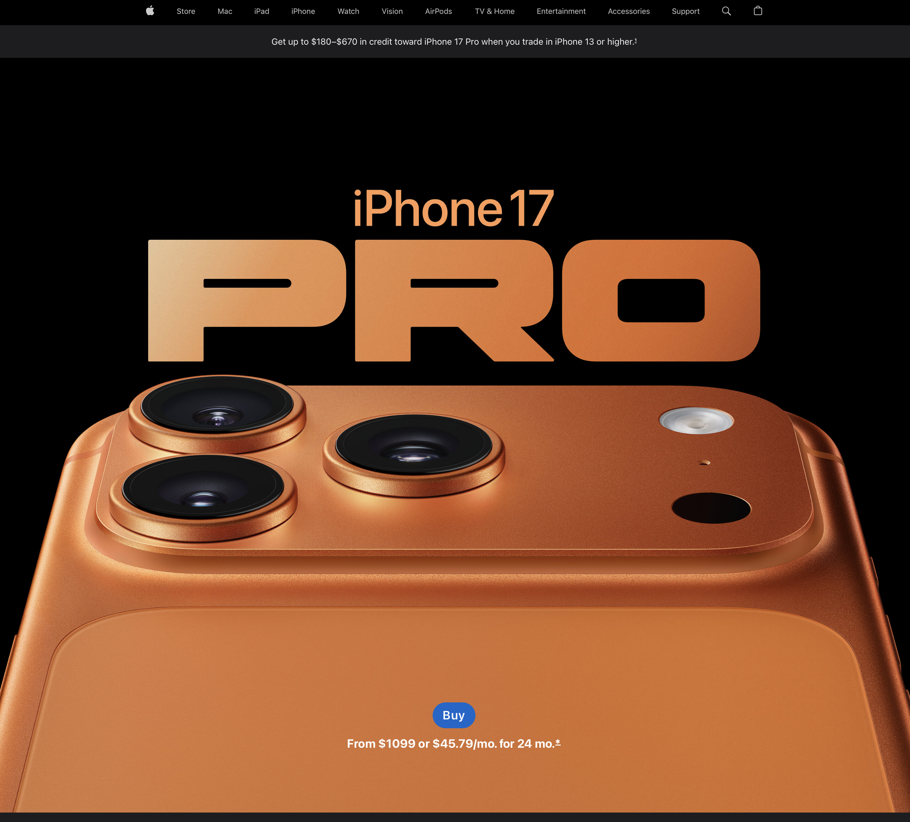
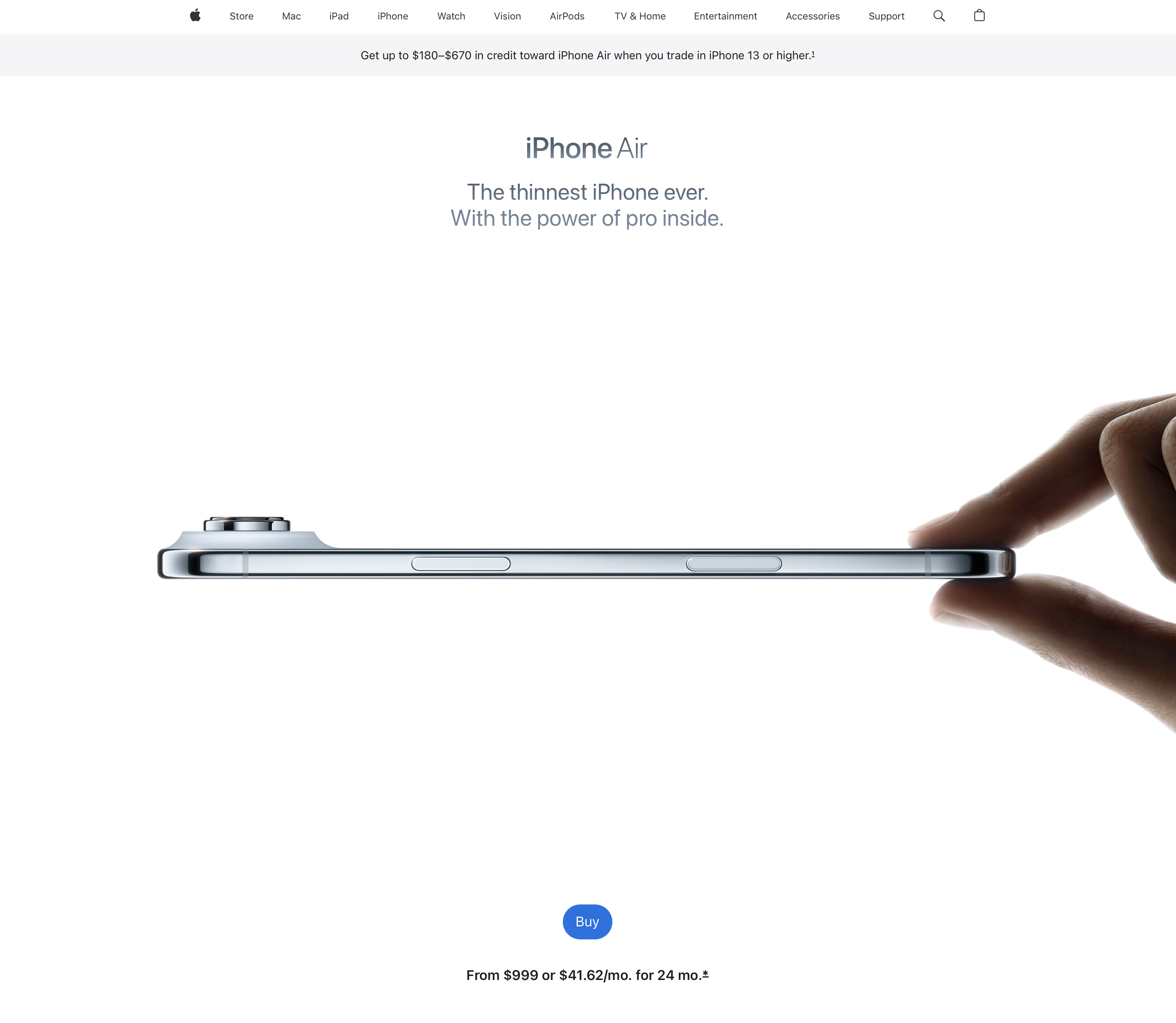
I’ll add that I suspect San Francisco might effectively be Apple’s “forever font”. Forever is a long time, but San Francisco, in its default appearance, strives for the sort of timelessness that Helvetica achieved. And San Francisco offers a wide (no pun intended) variety of widths and weights. This is San Francisco. This is too. (Screenshots for posterity, when Apple’s website changes: iPhone 17 Pro and iPhone Air.)
I also suspect that Apple Silicon is Apple’s “forever architecture”.