Norbert Heger, with a perfectly illustrated post, “The Struggle of Resizing Windows on macOS Tahoe”:
Since upgrading to macOS Tahoe, I’ve noticed that quite often
my attempts to resize a window are failing. This never happened
to me before in almost 40 years of using computers. So why all
of a sudden?It turns out that my initial click in the window corner
instinctively happens in an area where the window doesn’t respond
to it. The window expects this click to happen in an area of 19 ×
19 pixels, located near the window corner.If the window had no rounded corners at all, 62% of that area
would lie inside the window.But due to the huge corner radius in Tahoe, most of it — about
75% — now lies outside the window.
Here is Heger’s illustration of the hit target for the invisible resize button on MacOS 26:

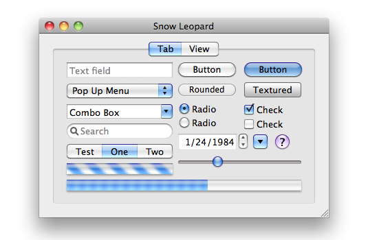
It was, I’d argue, a small mistake for Apple to stop putting a visual affordance in the lower right corner of windows to show where to click to resize the window. It was a bigger mistake to change the scrollbars on MacOS to look and work like those on iOS — invisible, except while you’re actually scrolling (by default, that is — savvy Mac users keep them always visible). Those changes happened long ago, in Mac OS X 10.7 Lion, released in July 2011. John Siracusa’s 10.7 review illustrates the before and after. Before (10.6):

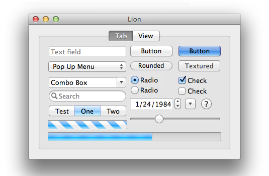
After (10.7):

I think everything about the 10.7 Lion GUI looks better than the 10.6 Snow Leopard GUI — except for the omission of the resize affordance in the corner. The visible resize affordance didn’t just tell you where to click to resize the window, it also told you that the window could be resized in the first place. In 10.6 and earlier, a window that could be resized showed you that it could be resized because it had a visible indicator. Windows that didn’t have that indicator were windows whose size was fixed. From 10.7 through today, the only way to know if a window even can be resized is to move your mouse cursor to the corner and try. The grippy-strip affordance offered contextual information about the window.
I can imagine the thinking at Apple behind this change, 15 years ago. The visible grippy-strip affordance in the lower-right corner isn’t really necessary. All users “know” that they can resize windows by clicking and dragging from the corner. And, although in ancient times users could only resize windows by clicking in the affordance in the lower-right corner, by 2011 it had long been the case that users could resize windows in two dimensions starting from any corner, or in one dimension starting from any edge of the window. (But windows on the Mac used to have visible edges denoting the window chrome, too. The Mac’s history is replete with glorious examples of UI clarity and precision.) So why draw the resize affordance in the lower-right corner when you can resize from any corner or window edge? Plus, the space for the lower-right grippy-strip affordance was made by the empty space at the intersection of vertical and horizontal scrollbar channels — and since Apple decided to make scrollbars invisible (by default) in Mac OS X 10.7 in 2011, there was no longer an otherwise unused square space in the corner for the resize affordance to be drawn. (It was sort of like the Free Parking space on a Monopoly board.)
One can argue with the logic behind these changes, 15 years ago. I’ll repeat that I think it was a grave error to make scrollbars invisible by default. I would argue that while the visible grippy-strip isn’t necessary, it’s nice to have. (As noted above, its presence showed you whether a window could be resized.) But there was, clearly, logic behind the decisions Apple made in 2011. They were carefully considered. The new logic was that you no longer look for a grippy-strip to click on to resize a window. You simply click inside the edge of a window. And of course Apple added a small affordance to the hit target for those edges, such that if you clicked just outside the window, that would count as “close enough” to assume you intended to click on the edge. Most users surely never noticed that. A lot of nice little touches in UI design go unnoticed because they’re nice little touches.
Until MacOS 26, most of the hit target for initiate the resizing of a window was inside the window. Because, of course, right? Even though MacOS (well, Mac OS X) stopped rendering a visible resize grippy-strip 15 years ago, the user could simply imagine that there was still a grippy area inside the lower right corner of every resizable window. It would make no sense whatsoever for the click target to resize a window to be outside the window. Why would anyone expect that? It would work against what our own eyes, and years of experience, are telling us. You pick up a thing to move it or stretch it by grabbing the thing. Not by grabbing next to the thing.
The windows on MacOS 26 Tahoe don’t really have comically large, childish corner radiuses. They just look like they do because some jackasses at Apple — all of whom, I pray, are now at Meta — thought they looked better that way. It’s a straight-up inversion of Steve Jobs’s maxim that design is about how things work, not how they look. I can think of no better example to prove that the new UI in MacOS 26 Tahoe was designed by people who do not understand or care about the most basic fundamental principles of good design.
The good news is, I have a solution. Do not upgrade to MacOS 26 Tahoe. If you have already upgraded, downgrade. Why suffer willingly with a user interface that presents you with absurdities like window resizing affordances that are 75 percent outside the window?
